
Website redesigns are always controversial because most of us, however progressive we may claim to be, hate change. Facebook became annoying and unusable because they change the look, feel, and functionality of the website every 8 minutes. Twitter is currently walking that fine line themselves, with this blue line blur that's successfully confusing users and clogging timelines.
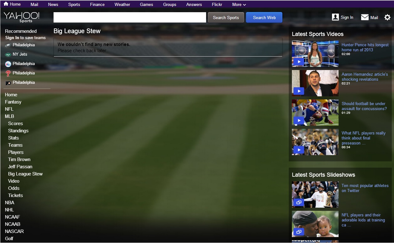
In time, redesigns can be a good thing. But until visitors become comfortable and the website actually works, there's going to be issues. That's what Yahoo Sports is currently realizing. Above you can see a screenshot from yesterday of the purported Big League Stew homepage, which has apparently drifted off into outer space.
Yahoo claims the redesign is all about personalization and mobilization, but in the first couple days readers are finding they can't do a number of things on the website. On the Yahoo Sports feedback page, these are the top four highly rated comments:
1) "Apparently you can no longer look up career totals for NBA players. I was attempting to look up Tracy McGrady's career point totals, but all that is accessible are his game averages. So what, to find this statistic (which used to be as easy as stealing candy from a baby) I have to do the math in order to figure it out? This is only 1 minor complaint out of thousands I could come up with."
2) "The new format is awful. I cannot find the links to blogs about the teams, I hate the new background and "scrolling" links. Why did you change what wasnt broken? Please go back to the older version/style of your website or I will stop coming here and be forced to find other websites to use. The new format sucks."
3) "The old format was elegant and pleasant to read. The team pages on the old format had all the information up front, now I have to scroll scroll scroll scroll… Im not on a tablet, i dont want my sports page to look like ESPN, I wont be using yahoo sports anymore."
4) "Get rid of the new format. i hate it. there is no way to follow the baseball game, or check the daily scores in tennis any more."
Feedback on Twitter was just as vociferous. As always, these are Real Tweets from Real People…
i'm expecting a dancing hamster to go with the yahoo sports redesign. maybe some blingee. i feel like i'm drunk.
— Trevor-Ralphio Bort (@trevor_0) August 28, 2013
Yahoo! Sports redesign is terrible. Endless scrolling? No thanks. At the very least the background could match the sport you are looking at.
— Michael Clair (@TheClair) August 27, 2013
The new @YahooSports redesign hurts my eyes.
— Wesley Lee (@wll) August 27, 2013
I really can't believe how bad Yahoo Sports! redesign is – one of the worst looking pages on the internet
— Jeff Grant (@JeffGrantSports) August 27, 2013
I remain far more offended by the Yahoo Sports site redesign than the new USA Hockey jerseys.
— Charlie O'Connor (@THG_Charlie) August 27, 2013
Ugly Yahoo! Sports redesign is ugly.
— Matt Galloway (@themattgalloway) August 27, 2013
. @YahooSports redesign has taken all the fun away from watching baseball box scores update to monitor my fake team. #ButSeriously #itsucks
— Dan Pasquini (@squeenie) August 28, 2013
The new @yahoosports design has to be the worst site redesign of all time. I definitely designed better sites in 8th grade computer class.
— Eric Conner (@econoar) August 28, 2013
Speaking of PCP RT @ChrisBurke_SI: I still don't understand what happened to the Yahoo Sports layout.
— World of Isaac (@WorldofIsaac) August 27, 2013
People are facebook-outrage levels disappointed at this new Yahoo! sports layout somehow.
— Matthew (@hustledouble) August 27, 2013

Comments are closed.